 |
 |
 |
 |
 |
 |
 |
 |
 |
 |
 |
 |
 |
 |
Baronial Charters given on December 8, 2007.
This is my very first piece of scribal work, in the illumination category. I've been practicing illumination basics with kingdom promissory charters for the past year or so. I've only begun to practice calligraphy.
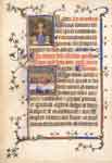
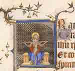
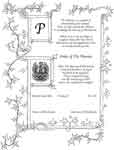
At this past fall's Collegium Caidis, I was given the information I needed, and the encouragement from Mistress Aliskye and Mistress Maeb to begin my first whole piece of scribal art, from initial sketch to inking, painting, and calligraphy. This original was the piece I chose to copy from (a period practice I've been told). The dragon is what caught my fancy. I began the initial sketching onto graph paper at Collegium, and brought it home, to let it flounder for a bit in storage.
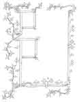
Eventually, finding time again after my many sewing projects, I began to ink the sketch, and had found text to use for my first piece, a poem written by a friend from LJ. This never did make it to that kind of piece.
Our Baron and Baroness desired to provide awards to a few deserving people, but no scroll designs had been approved (although at least one was submitted by another who is well qualified to provide them - I don't know what happened). One thing led to another, and after a rather vivid dream of mine, I decided to at least submit this to the Barony.
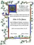
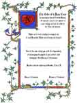
I scanned this into my computer. Not being a practiced calligrapher and tight on time, I used some modern fonts, a found bit of clip art, and the appropriate wordings for the Order of the Phoenix. After much fiddling, I submitted my offering to the Baron and Baroness. The design was accepted a few days later, and this is my resulting piece, er pieces, as another last minute award was also requested, the Order of le Beau Coeur.
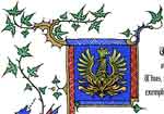
Because of the last minute nature of this request (basically the week before our Yule event) only one image was hand painted (from the black and white image printed onto smooth card stock). Once painted, the image was again scanned at 600 dpi, cleaned up digitally, and printed onto the same smooth cardstock at Kinko's. The font I used is called "Broken Planewing", which I felt was a bit more decorative in its flourishes than the regular Blackletter or Gothic type fonts.
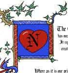
Le Beau Coeur (only one day notice for this) was modified in the corner image with a bit of clip art found online, an outline of a heart, colored and enhanced, and the N was added to represent Nordwache, our barony.
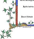
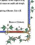
There are a few imperfections (ok, several), as this was my first project, and I was rushed. One major problem was I inserted AS XL, instead of AS XLII for the date. I still don't understand the SCA dating system, so I plead newbie in this case, but I will not forget it ever again.
It is my full desire to remake this design completely by hand, including hand written calligraphy, using the appropriate hand of Gothic textura quadrata, with Gothic capitals of one form or another. This remake will be used for future versions of the Phoenix award, with blanks for the dates to be inserted.
I will eventually make that complete design for my own use, it just may not be with this particular illumination design.
Home
Kimiko Small Designs
Joan Silvertoppe's SCA Resumé
Warderobe Accounts
Brodyworke Accounts
Scriptor Arts Folium
Tudor Research
Workshops & Articles
Inspiration Gallery
Largesse
Favorite Links
About Me
Contact Me
http://www.kimiko1.com
Entire website, graphics, and text (unless otherwise stated)
© 2003-2013 Kimiko Small, All Rights Reserved


